Oncology - UX Case Study

Problem Statement

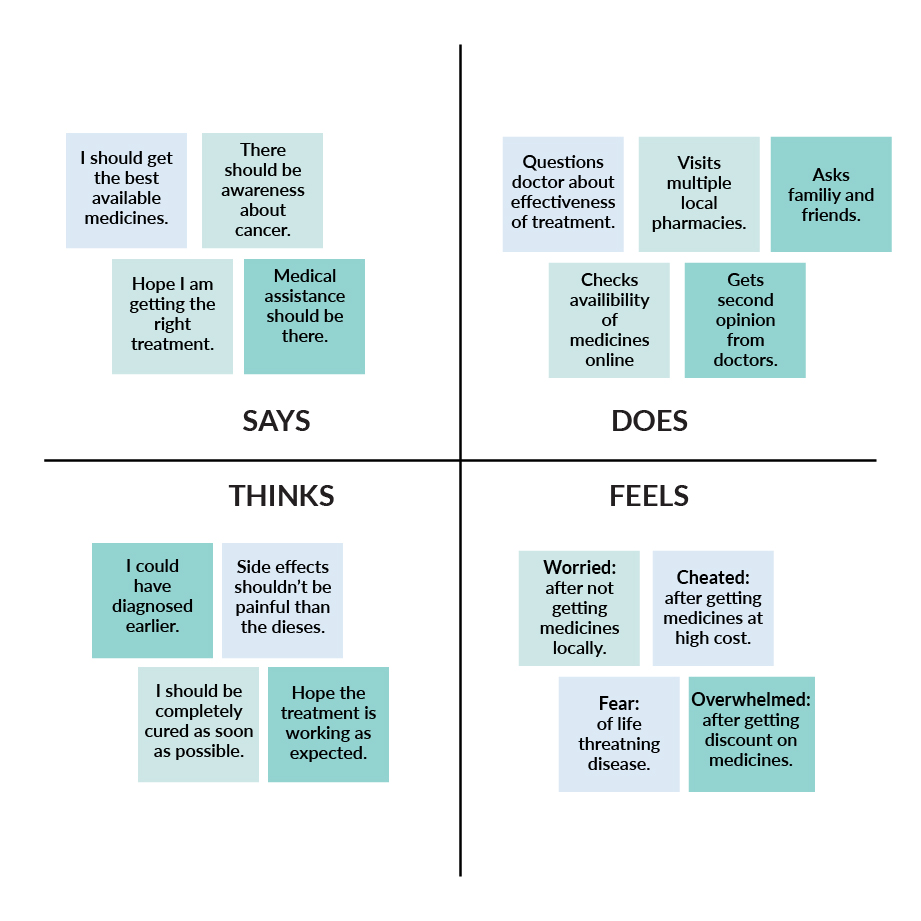
Nigeria has the highest cancer mortality rate in Africa, according to the World Health Organization. Low awareness, late detection, unavailability of medicines and high cost of treatments are major factors contributing to increasing mortality in the west African nation.

In Nigeria, cancer is responsible for around 72,000 deaths every year, with an estimated 102,000 new cases annually.

Solution

Our solution was focused towards Awareness (information about cancer), Availability and Affordability (cost of treatment and medication). Our first priority was creating cancer awareness amongst people and then connecting them with our client’s initiative of affordable cancer medications.
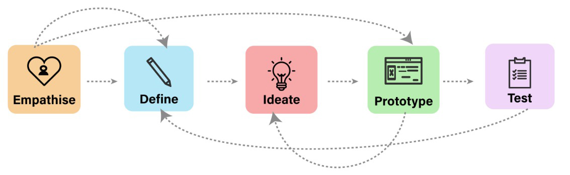
Process

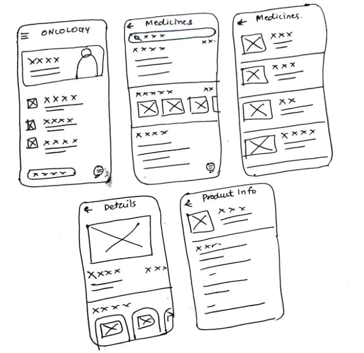
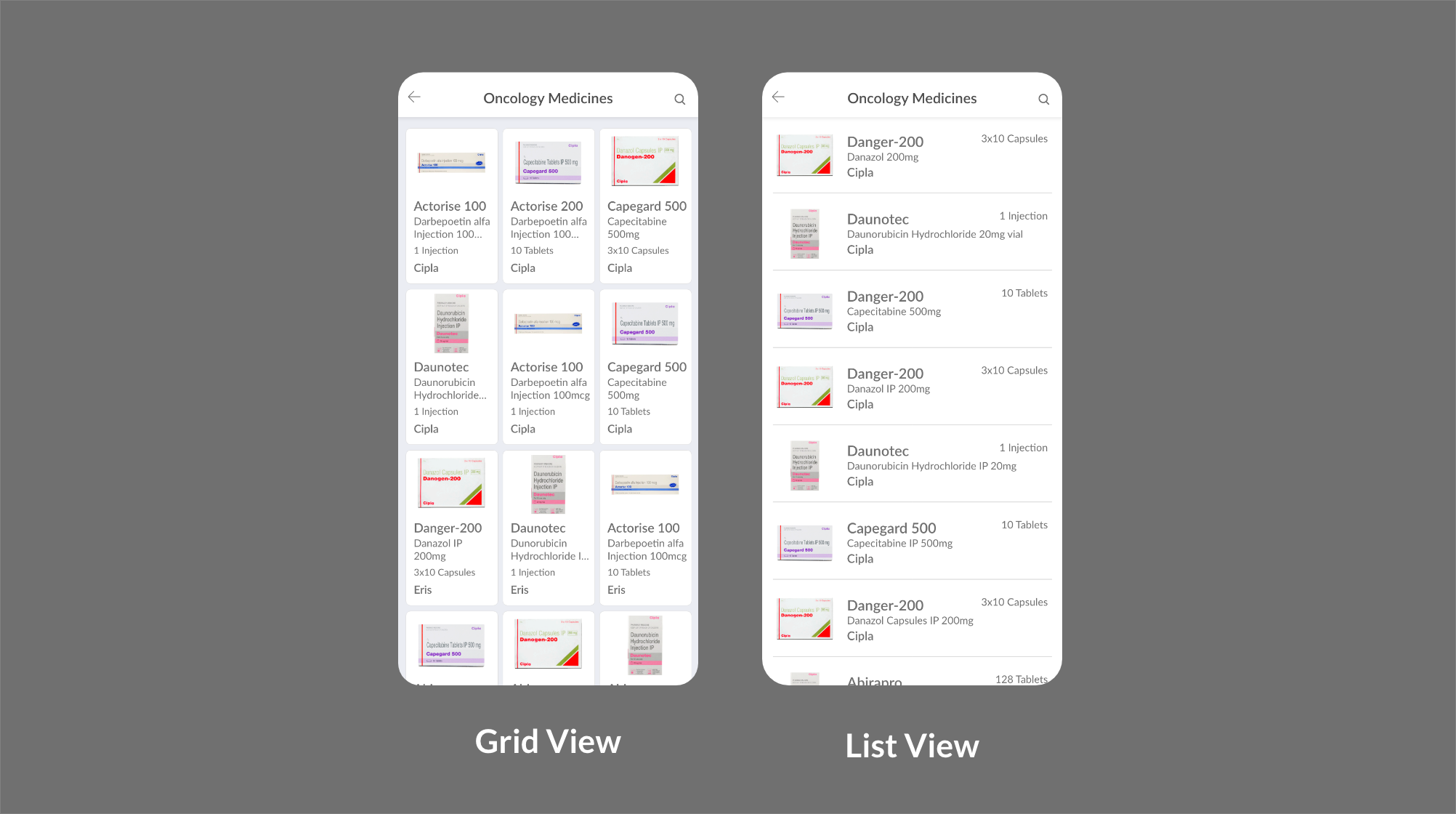
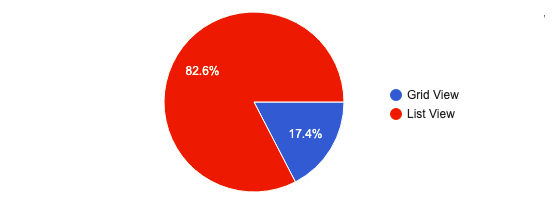
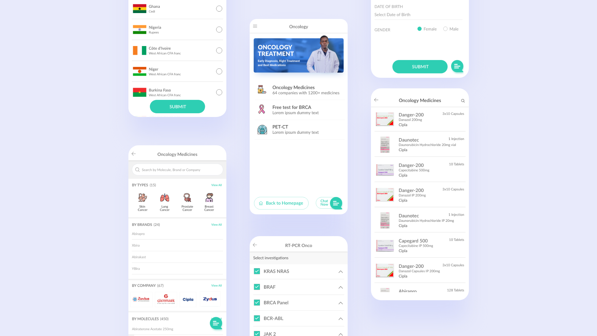
We followed the iterative design thinking process.

User Research

Secondary Research

We performed Online Desk Research to collect the data from existing resources. We refined our searching techniques to get promising and relevant research. We came across the following facts and figures during our research:

  • Lack of information, delay in reporting cancer-related cases fuels higher mortality rate in Nigeria.
  • Early, accurate cancer diagnosis can significantly increase a patient’s chance of survival. However, many hospitals in Africa are not equipped with the machines or operating technicians needed to meet demand.
  • Nigeria’s pharmaceutical sector is largely dependent on foreign exchange, which is unpredictable and volatile. This results in lack of drug price control. Since many patients cannot afford the costs, they often abandon hospital tests and treatment.
  • Doctors have to prescribe only the available medicines locally which are sometimes less effective compared to the latest high-quality medicines.

Empathy Mapping

To sum up our learnings from user research, we created an Empathy map. This helped our team mates and stakeholders in understanding our users.

User Interviews

Due to privacy and few other constraints we were not involved in face to face user interviews. We created our questionnaire and forwarded it to the doctor’s panel. The questionnaire consists of basic information about the patient, their cancer experience, pain points and goals. Based on these insights, we created user personas.

User Personas

We created user personas to understand user needs and pain points. It helped us understand things from user's perspective.

Ideation

How Might We

We conducted brainstorming sessions to generate How Might We (HMW) questions and their possible answers. These sessions were quite interesting and insightful.

  • How might we connect the healthcare eCommerce platform with cancer patients?
    Oncologists will promote the eCommerce platform for getting the medicines.

  • How might we make customers aware of the eCommerce platform?
    By running promotional campaigns locally as well as on social media and google ads.

  • How might we educate and encourage online ordering?
    By highlighting the effectiveness of medicines and offering online discounts.

  • How might we help patients have a smooth experience ordering medicines?
    We will have coordinators and a chat support team to continuously keep in touch with patients and doctors throughout the treatment.

  • How might we remove the patient's hassle of understanding the prescription and finding the medicines?
    We can simply ask patients just to upload their prescription. Our customer care executive can take care of understanding the prescription and adding medicines to the cart. Patients will have to just check and confirm to proceed.

  • How might we keep customers engaging?
    By personalised follow ups via email, sms, and whatsApp.

Information Architecture

This project consisted of three interconnected systems. Success of the project was heaviliy dependant on the smoother transition between these three systems.

Card Sorting

We used open and closed card sorting methods as a part of usability testing to organize the design and content more effectively. We asked our participants to organise the cards as per their understanding. We renamed a few categories as they were confusing to the users. The card sorting method helped us get answers to the following questions.

  • How do the choices of various groups of users (general customers, patients, doctors etc) differ?
  • Should the information and content on a website be grouped into certain categories?
  • How many sections should be on the landing page for optimum results?
  • How should the navigation be designed?
  • How many categories should there be, and how many navigation levels should be underneath those categories?
  • What should links, categories and content groups be named for the best results?

Low Fidelity Wireframes

Usablity Testing

We had conflicting opinions between stakeholders and designers on few screens. So we decided to have A/B Testing for heuristic evalutaion from UX experts.

Test Result for What is the most efficient layout for viewing prescription medicines?

High Fidelity Prototypes

Takeaways

  • Many times, clarifying the problem is often as big a task as solving it or perhaps even bigger. In order to understand the subject in detail, we did a lot of research. We went through a lot of articles and statistics.
  • Being a wicked problem, this problem can’t have a single solution. To come up with a valuable solution, we tried to gain deeper insights into the people involved to reframe and resolve the problem to some extent.
  • It is always difficult to deliver within constraints. But at the same time it increases innovation.